RGB vs CMYK: Which Color Mode to Use (And When It Actually Matters)
You design a logo on your computer. The blue looks perfect. Electric. Vibrant. You send it to the print shop for business cards. The cards arrive and the blue looks... dull. Muted. Like someone put a grey filter over it. You call the printer. They say “did you send us an RGB file?” You have no idea what that means. But you are about to learn, and it is going to save you from this exact situation for the rest of your life.
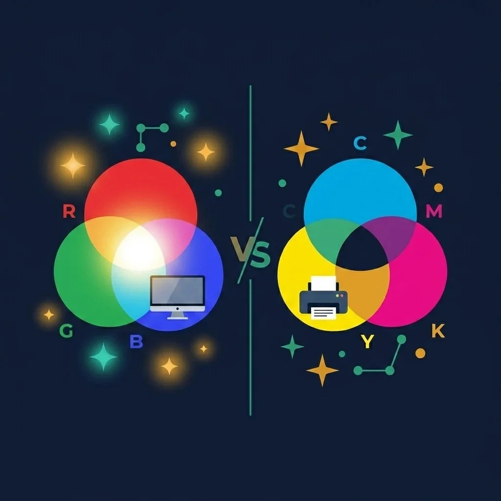
RGB and CMYK are two different systems for representing color. One is for screens. One is for ink. They do not produce the same range of colors. This mismatch is responsible for every single “why does my print look different from my screen” complaint in the history of printing. And understanding it takes about five minutes.
RGB: colors made from light
RGB stands for Red, Green, Blue. These are the three colors of light that your screen uses to create every color you see. Each pixel on your monitor, phone, or tablet contains tiny red, green, and blue sub pixels that emit light at different intensities.
When all three are at maximum intensity, you get white. When all three are off, you get black. Mix red and green light and you get yellow. Mix red and blue and you get magenta. Mix all three at various levels and you can produce about 16.7 million different colors (256 levels per channel, 256 x 256 x 256 = 16,777,216).
This is called an additive color model because you start with darkness (no light) and add colors of light to create brighter results. The more light you add, the brighter the color, with full intensity of all three producing white.
Every digital image you see on a screen is RGB. Every website. Every app. Every digital photo. Every video. If it is on a screen, it is RGB. Web developers write colors as hex codes (#FF5733) or rgb() functions, both of which are just different notations for the same RGB values.
CMYK: colors made from ink
CMYK stands for Cyan, Magenta, Yellow, and Key (which is black). These are the four ink colors that printers use to reproduce images on paper, fabric, packaging, and basically any physical surface.
Unlike RGB which starts with darkness and adds light, CMYK starts with white (the paper) and subtracts light by laying ink on top. Cyan ink absorbs red light. Magenta ink absorbs green light. Yellow ink absorbs blue light. The ink blocks certain wavelengths from reflecting off the paper, and whatever light is left is what your eyes perceive as the color.
This is called a subtractive color model. You start with white (all light reflecting off the paper) and subtract colors by absorbing them with ink. In theory, combining cyan, magenta, and yellow should absorb all light and produce black. In practice, real ink is not perfect and you get a muddy dark brown instead. That is why the fourth ink, K (black), exists: to produce true rich blacks and save ink on dark areas.
Why the same color looks different on screen vs. in print
This is the part that catches everyone. Your screen can produce colors that ink physically cannot reproduce. Neon green, electric blue, hot pink, vivid orange. These colors exist in the RGB gamut (the range of possible colors) but sit outside the CMYK gamut.
When a printer encounters an RGB color that cannot be reproduced with CMYK inks, it maps it to the closest color it can produce. That closest color is always duller, less saturated, and less vibrant than the original. The bright electric blue on your screen becomes a more muted, slightly greyish blue in print. It is not the printer’s fault. It is physics. Ink reflecting light will never match a light emitting pixel in vibrancy.
The reverse is also true, sort of. There are a handful of CMYK colors (certain deep cyans and some dark tones) that are slightly outside the standard sRGB gamut. But in practice, the overwhelmingly common problem is RGB colors that CMYK cannot match, not the other way around.
When to use RGB
Use RGB for everything that will be displayed on a screen. This includes:
Websites and web apps. Social media posts and ads. Email newsletters and signatures. Digital presentations (PowerPoint, Google Slides, Keynote). Mobile apps and software interfaces. Digital photography for online sharing. YouTube thumbnails and video content. Any image that will be viewed on a monitor, phone, tablet, or TV.
If you are working in Canva, Figma, Photoshop, or any design tool and your output is digital, stay in RGB. Your colors will be more vibrant, your file sizes will be smaller (three channels instead of four), and every screen on earth will display them correctly.
When to use CMYK
Use CMYK for anything that will be physically printed with ink:
Business cards. Brochures and flyers. Packaging and labels. Posters and banners. T shirts and merchandise (though screen printing and DTG have their own quirks). Magazine and newspaper ads. Book covers and interiors.
If you are sending a file to a professional print shop, they will almost always ask for CMYK. Consumer printers (your home inkjet) accept RGB and handle the conversion internally, but the result is less predictable than converting yourself.
How to convert RGB to CMYK without ruining your design
The conversion is straightforward but requires attention. Here is what happens and what to watch for.
Step 1: Design in RGB first. Always design in RGB even if the final output is print. RGB gives you a wider color palette to work with during the creative process. You can see more vibrant options and make design decisions with the full range of screen colors available.
Step 2: Convert to CMYK. In Photoshop, go to Image, Mode, CMYK Color. In Illustrator, go to File, Document Color Mode, CMYK Color. In Canva Pro, export as CMYK PDF (print). When the conversion happens, you will see some colors shift. This is normal and expected.
Step 3: Adjust the shifted colors. After converting, review every element. If a color shifted too much, adjust it in CMYK mode until it looks acceptable. Some designers keep an RGB version and a CMYK version side by side and tweak the CMYK until it is as close as possible.
Step 4: Request a proof. Before committing to a full print run, ask your printer for a proof (a single printed sample). Compare it to your screen. If the colors are unacceptable, adjust and proof again. Professional printers expect this process.
Hex codes, RGB values, and CSS colors
If you are a web developer or have ever picked a color for a website, you have worked with RGB even if you did not realize it. Hex color codes are RGB values in hexadecimal notation.
The code #FF5733 breaks down as: FF (255 in decimal) for red, 57 (87) for green, 33 (51) for blue. That gives you a warm orange red. CSS also accepts rgb(255, 87, 51) which is the same color in decimal notation. And hsl(11, 100%, 60%) which is the same color in hue/saturation/lightness. All of these are different ways to express an RGB color.
Our color picker and color palette generator work in RGB because they are designed for digital use. The colors you pick are hex and RGB values ready for CSS, design tools, and any digital application.
sRGB vs. Adobe RGB vs. ProPhoto RGB
Within the RGB world, there are different color spaces that define exactly which shades of red, green, and blue are available. Think of it as different sized boxes of crayons.
sRGB is the standard for the web and most consumer displays. It covers about 35% of the visible color spectrum. Every website, every social media platform, and the vast majority of monitors use sRGB. If your work is going on the internet, sRGB is all you need.
Adobe RGB is wider than sRGB, covering about 50% of the visible spectrum. It includes more saturated greens and cyans. Some professional monitors and high end cameras support it. Useful for print workflows because Adobe RGB maps more closely to CMYK gamut in certain color regions.
ProPhoto RGB is the widest common color space, covering about 90% of the visible spectrum. It can represent colors that no monitor can currently display. Used in professional photography to preserve maximum color information for future editing.
For most people, sRGB is the only color space that matters. Use it for web. Use it for social media. Use it for casual photography. Adobe RGB and ProPhoto RGB are professional tools for specific workflows and if you need them, you already know you need them.
The practical decision tree
Is your design going on a screen? Use RGB. Is it going on paper? Convert to CMYK before sending to the printer. Is it going both places? Design in RGB, keep an RGB version for digital, convert a separate copy to CMYK for print. Will the color shift bother you? Request a proof from the printer before the full run.
That is genuinely the entire decision. It sounds simple because it is. The only complication is remembering to do the conversion, and checking the result before committing to thousands of prints with a color that looks nothing like what you designed.
Work With Colors
Pick colors, generate palettes, and get hex/RGB values for your designs. Free and instant.