How photo filters work, and what each one does to your pixels
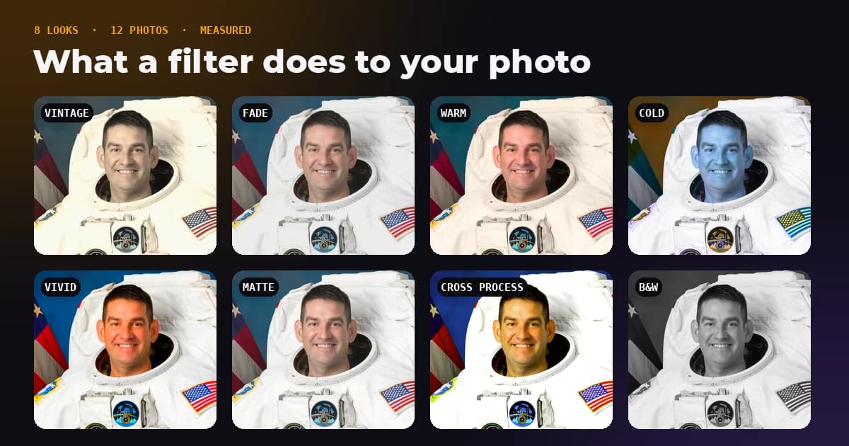
A photo filter looks like magic in an app, but underneath it is a short recipe: raise the brightness a little, lower the saturation, tint it towards orange, in that order. We took the eight filter looks from our Image Filters tool, applied each to 12 photographs, and measured exactly what they do to brightness, contrast, colour and the detail in the brightest and darkest parts of the picture.
- What is a photo filter?
- A fixed recipe of colour steps such as brightness, contrast, saturation, sepia and hue rotation, applied to every pixel in order.
- Which filter loses the most detail?
- Cross Process. It pushed 38.7 percent of all colour values to pure black or pure white, against 8.8 percent in the originals.
- Does black and white make a file smaller?
- A little. Our black and white JPEGs were 7.0 percent smaller than the colour ones at the same quality.
- Does the order of steps matter?
- Yes. Running the Vintage recipe backwards changed pixels by up to 9 levels out of 255.
What a filter really is
Almost every filter in a browser, and most in phone apps, is built from the same handful of operations. The web standard for them, the W3C Filter Effects specification, defines each one as simple arithmetic on the red, green and blue value of every pixel.
- Brightness multiplies every value. At 1.1, a pixel of 100 becomes 110.
- Contrast stretches or squeezes values around the middle, 127.5. Below 1 everything drifts towards grey, above 1 lights get lighter and darks get darker.
- Saturate mixes each colour with its own grey. At 0 the photo is black and white, at 2 colours are twice as far from grey.
- Sepia runs every pixel through a fixed 3 × 3 colour matrix that maps it onto brown tones. The red output, for example, is 0.393 of the red, plus 0.769 of the green, plus 0.189 of the blue.
- Hue rotate turns every colour around the colour wheel by a set angle, while trying to keep brightness steady.
- Grayscale replaces each pixel with its luminance: 0.2126 of the red, 0.7152 of the green and 0.0722 of the blue. Green counts most because human eyes are most sensitive to it.
After each step the values are rounded to whole numbers and clamped between 0 and 255. That clamping is where filters lose information, and it is why the order of the steps matters.
The eight recipes
| Filter | Recipe, applied left to right |
|---|---|
| Vintage | sepia 0.5, saturate 0.85, brightness 1.05, contrast 0.95 |
| Fade | brightness 1.1, contrast 0.85, saturate 0.8 |
| Warm | sepia 0.2, hue rotate minus 10°, saturate 1.2 |
| Cold | hue rotate 200°, saturate 0.9, brightness 1.05 |
| Vivid | saturate 1.8, contrast 1.1 |
| Matte | contrast 0.9, brightness 1.1, saturate 0.85 |
| Cross Process | contrast 1.3, saturate 1.4, hue rotate 20°, brightness 1.05 |
| B&W | grayscale 1 |
What each filter did to 12 photos
Our test set is 12 public domain NASA photographs: portraits, Apollo and Mars rover shots, Hubble and Webb images, and Earth at night and by day from the space station. It leans dark, with plenty of black space, which is why 8.75 percent of the original colour values already sit at pure black or white. The figures below are averages across all 12 photos.
| Filter | Brightness | Contrast | Saturation | Warmth (red minus blue) | Clipped values | JPEG size |
|---|---|---|---|---|---|---|
| Original | 79.4 of 255 | 53.1 | 35.2% | +1.9 | 8.75% | 3.07 MB total |
| Vintage | +17.5% | +7.7% | −47.8% | +11.6 | 0.00% | +0.5% |
| Fade | +17.2% | −7.5% | −40.7% | −0.4 | 0.00% | −3.9% |
| Warm | +4.2% | +3.8% | −1.8% | +7.6 | 9.21% | +2.0% |
| Cold | +5.0% | +4.5% | −10.4% | −4.0 | 9.92% | +0.6% |
| Vivid | −3.0% | +6.0% | +39.1% | +0.8 | 30.05% | +5.6% |
| Matte | +16.5% | −1.3% | −32.4% | −0.2 | 1.14% | −1.1% |
| Cross Process | −3.1% | +19.6% | +15.1% | +0.9 | 38.72% | +10.3% |
| B&W | 0.0% | 0.0% | −100% | −1.9 | 7.63% | −7.0% |
Brightness is the average luminance, contrast is how spread out the luminance values are, and saturation is the average colourfulness of each pixel. Warmth compares the red channel with the blue one, so a positive change means a warmer, more orange picture.
Clipping: where detail goes to die
A clipped value is one pushed to 0 or 255, where every shade beyond it collapses into the same flat colour. The texture in a bright sky or a dark jacket lives in exactly those extremes. Vivid clipped 30 percent of all colour values, and Cross Process nearly 39 percent, more than four times as many as the originals had.
The looks that feel gentle did the opposite. Vintage and Fade clipped nothing at all, because their lower contrast pulls the blacks up and the whites down, which is precisely the washed out film look they are going for. That is worth knowing before you choose: a strong filter can make a photo look more striking on a phone and still throw away detail you would want in a print.
Once a value is clamped to 255, the shades it used to have are gone from that file. Filters do not change your original, so keep it, and apply a look to a copy.
Why black and white keeps the same brightness
The black and white filter changed average brightness by exactly 0.0 percent. That is not luck. The grayscale step replaces each pixel with its own luminance, using the same weights we used to measure brightness, so the light level of every pixel stays the same and only the colour goes.
It also made the JPEGs 7.0 percent smaller. JPEG stores brightness and colour separately and already keeps the colour at lower resolution, so removing colour saves less than you might guess, but it is still a saving for free.
Why the order of the steps matters
Colour matrices multiply, and matrix multiplication is not like normal multiplication: sepia then saturate is not the same as saturate then sepia. On top of that, every step clamps and rounds before the next one begins.
To see how much it matters, we ran the Vintage recipe as designed and then in reverse order, contrast first and sepia last, on all 12 photos. Pixels differed by 1.7 levels on average and by up to 9 levels at worst. That is subtle on screen, but it means two apps with the same list of steps can produce visibly different looks if they apply them in a different order.
Why filters used to break on iPhones
Browsers have a quick shortcut for filters: set a filter on a canvas and draw the photo through it. The problem is Safari. MDN's compatibility data lists canvas filters in Safari 18 only behind a developer setting, off by default, and almost every iPhone browser uses Safari's engine. A web tool that relies on the shortcut looks fine in the preview, which is drawn with CSS, and then quietly downloads an unfiltered photo on an iPhone.
Our Image Filters and Adjust Image tools apply the W3C matrices to the pixels directly, with the same rounding and clamping between steps, so the download matches the preview on every browser.
How to choose a filter
- Portraits: Warm or Matte flatter skin without clipping it. Avoid Cold, which turns skin grey and blue.
- Landscapes with sky: Vivid makes colour pop but clipped nearly a third of values in our test. Check the brightest clouds before saving.
- Product photos: skip colour shifting looks entirely. Buyers need the real colour, so use brightness and contrast in Adjust Image instead.
- Documents and scans: B&W makes text easier to read and the file a little smaller.
- A soft, nostalgic look: Vintage or Fade, which lift the blacks and never clipped a single value in our test.
Try all eight looks on your photo
Every filter previews live and downloads at full resolution. The photo is processed in your browser and never uploaded.
The bottom line
A filter is a short list of colour steps, and each step is simple arithmetic. The differences between looks come down to how much brightness, contrast and colour they move, and how many values they push off the ends of the scale. The gentle looks lose nothing. The punchy ones can clip a third of the picture. Keep the original, apply the look to a copy, and look at the brightest and darkest parts of the photo before you share it.
Frequently asked questions
Sources and method
Test set: 12 public domain NASA photographs at 1,200 pixels wide. Each filter recipe was applied with the W3C Filter Effects colour matrices and transfer functions, rounding and clamping to 0 to 255 after every step, exactly as our tools do. Brightness is mean luminance with Rec. 709 weights, contrast is the standard deviation of luminance, saturation is the mean HSV saturation, warmth is the mean of red minus blue, and clipped values are the share of colour channel values at 0 or 255. JPEG sizes are totals at quality 85.
- W3C Filter Effects Module Level 1, filter functions and colour matrices
- MDN, CanvasRenderingContext2D.filter browser compatibility
- ITU-R Recommendation BT.709, the luminance weights
- NASA Image and Video Library, source of the test photographs
Applied to 12 photographs, the Cross Process look clipped 38.7 percent of colour values to pure black or white against 8.8 percent in the originals, while Vintage and Fade clipped none, and black and white JPEGs were 7.0 percent smaller. FreeImageTools, "How Photo Filters Work: What Each One Does to Pixels", September 27, 2026, https://freeimagetools.org/blog/image-filters-explained