How to invert image colors, and when it goes wrong
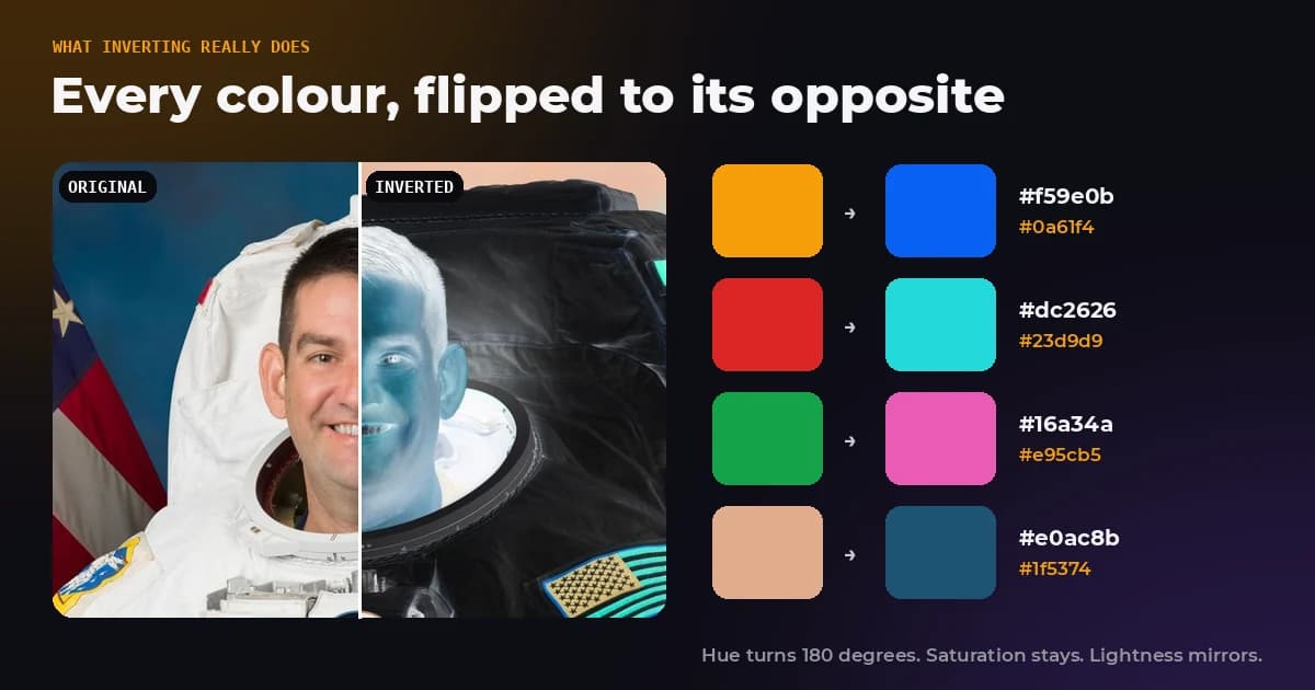
Inverting an image is the simplest edit there is. Every red, green and blue value is subtracted from 255, and that is the whole operation. Yet it does three things people rarely expect: it swaps every colour for its exact opposite, it changes contrast in ways that matter for dark mode designs, and a JPEG that is inverted and inverted back never quite returns to the original. We measured all three.
- How do I invert an image?
- Drop it into Invert Colors, check the preview and download. It runs in your browser, nothing is uploaded.
- Can I undo an inversion?
- Invert again. On PNG pixels the result is identical. Through JPEG saves it lands within 51 to 54 dB, which you cannot see.
- What happens to the colours?
- Every hue turns by exactly 180 degrees, saturation stays the same and lightness is mirrored. Red becomes cyan, orange becomes blue.
- Why is my scanned negative blue?
- Colour negative film has an orange base. Inverting turns that orange into blue, so it has to be removed first.
What inverting does to each pixel
A pixel stores three numbers from 0 to 255. Inverting replaces each one with 255 minus itself, so 0 becomes 255, 255 becomes 0, and 100 becomes 155. Black and white swap places, and every colour lands on the value that sits the same distance from the other end of the scale.
| Colour | RGB | Inverted RGB | Inverted colour |
|---|---|---|---|
| White | 255, 255, 255 | 0, 0, 0 | Black |
| Red #dc2626 | 220, 38, 38 | 35, 217, 217 | Cyan #23d9d9 |
| Amber #f59e0b | 245, 158, 11 | 10, 97, 244 | Blue #0a61f4 |
| Blue #2563eb | 37, 99, 235 | 218, 156, 20 | Gold #da9c14 |
| Green #16a34a | 22, 163, 74 | 233, 92, 181 | Pink #e95cb5 |
| Skin tone #e0ac8b | 224, 172, 139 | 31, 83, 116 | Dark blue #1f5374 |
The last row is why inverted portraits look alien. Warm skin tones become deep blues, and pale skin becomes dark, because the lightness flips along with the hue.
Hue turns 180 degrees, saturation stays put
Converting the results above to hue, saturation and lightness shows a clean rule. Inversion rotates the hue by exactly half a turn, leaves saturation untouched, and mirrors lightness around the middle.
| Colour | Before: hue, saturation, lightness | After inverting |
|---|---|---|
| Amber #f59e0b | 37.7°, 92.1%, 50.2% | 217.7°, 92.1%, 49.8% |
| Blue #2563eb | 221.2°, 83.2%, 53.3% | 41.2°, 83.2%, 46.7% |
| Red #dc2626 | 0°, 72.2%, 50.6% | 180°, 72.2%, 49.4% |
| Green #16a34a | 142.1°, 76.2%, 36.3% | 322.1°, 76.2%, 63.7% |
| Skin #e0ac8b | 23.3°, 57.8%, 71.2% | 203.3°, 57.8%, 28.8% |
That is why inverting a coloured logo never gives you a dark mode version of it. Every brand colour is replaced by its complement. Only black and white artwork inverts into something you would actually use.
Inverting a JPEG is almost, but not exactly, reversible
In theory inverting twice gets you back where you started, and on raw pixels it does: we inverted 12 photos twice as PNG and found zero difference in any pixel. In practice most images are JPEGs, and a JPEG is compressed again every time it is saved. So we inverted each photo, saved it as a JPEG, inverted that back and saved it again, all at the same quality.
| JPEG quality | Fidelity after two inversions | Largest single change |
|---|---|---|
| 95 | 51.59 dB | 4 to 30 levels |
| 92 | 52.71 dB | 3 to 30 levels |
| 85 | 53.56 dB | 3 to 31 levels |
| 80 | 54.33 dB | 3 to 32 levels |
| PNG (lossless) | Identical | 0 |
Everything above 50 dB is invisible, so for viewing purposes the round trip is fine. But the file is not the same file, a handful of pixels moved by up to 32 steps out of 255, and the effect adds up if you repeat it. If you need a perfect undo, keep the original or work in PNG until the last step.
The table also has a small surprise: lower quality settings drifted less. A JPEG saved at quality 80 is already rounded coarsely, and saving it again at quality 80 mostly lands on the same rounded values, so each extra pass changes less. File size barely moved either. The inverted JPEGs came out at 99.96 percent of the size of the originals, because inverting shuffles values without adding or removing detail.
Inverting changes contrast, which matters for dark mode
A tempting shortcut for a dark theme is to invert a light design. The trouble is that contrast, the thing that makes text readable, does not survive the trip unchanged. The WCAG contrast ratio is based on how bright colours look to the eye, which is not a straight line from 0 to 255, so flipping the values changes the ratios.
| Text on background | Contrast before | Inverted text on black | Contrast after |
|---|---|---|---|
| Grey #777777 on white | 4.48 | #888888 | 5.92 |
| Grey #595959 on white | 7.00 | #a6a6a6 | 8.63 |
| Grey #999999 on white | 2.85 | #666666 | 3.66 |
| Blue #2563eb on white | 5.17 | #da9c14 | 8.75 |
| Red #dc2626 on white | 4.83 | #23d9d9 | 12.00 |
| Amber #f59e0b on white | 2.15 | #0a61f4 | 4.03 |
| Black on white | 21.00 | #ffffff | 21.00 |
Every pair except pure black and white gained contrast when inverted, sometimes a lot. That sounds like good news, and for readability it often is, but it means an inverted design is a different design. Text that passed the 4.5 to 1 minimum for normal text in the light theme may now be far louder than intended, and the grey #777777 that failed at 4.48 on white quietly passes at 5.92 on black. Check contrast in both themes instead of assuming one follows from the other.
Why your scanned film negative turns blue
Black and white negatives are simple: dark where the scene was bright. Invert them and you get the photo back, which is why scanning old family negatives and inverting them works so well.
Colour negative film adds an orange mask, a tint built into the film to correct colour defects in the dyes. When you invert a scan, that orange becomes its opposite, a strong blue. As an example, an orange base of 255, 165, 90 inverts to 0, 90, 165, and that blue sits on top of every colour in the picture.
- Scan the negative including a little of the clear film between frames, which shows the mask on its own.
- Use your editor's levels or curves tool to set that clear area to white for each colour channel, which cancels the orange.
- Invert the image, then fine tune the white balance on something that should be neutral grey.
Dedicated scanning software does these steps for you, and our Invert Colors tool handles black and white negatives in one click.
Smart Invert and Classic Invert on a phone
Phones offer inversion as an accessibility setting for people who find dark backgrounds easier to read. On an iPhone, Apple describes Classic Invert as reversing all colours on the display, and Smart Invert as reversing them except for images, media and some apps that already use dark colour styles. These settings only change how the screen looks. Your photos and files are not modified.
How to invert an image
- In your browser: drop the image into Invert Colors, use the blend slider if you want a partial effect, and download a PNG.
- In Photoshop: Image, Adjustments, Invert, or Ctrl+I (Cmd+I on a Mac).
- In GIMP: Colors, Invert.
- In CSS:
filter: invert(1)inverts an element on screen without changing the file.invert(0.5)turns everything flat grey, because every value meets its opposite in the middle at 127.5.
Invert an image now
Free, no upload and no watermark. The blend slider lets you stop anywhere between the original and the full negative, and the result downloads as a lossless PNG.
The bottom line
Inverting is exact arithmetic: 255 minus each value, hue turned half a circle, saturation unchanged, lightness mirrored. It undoes itself perfectly on lossless pixels and nearly perfectly through JPEG saves. What it does not do is produce a usable dark mode, a correctly coloured film scan or a logo in its brand colours. For those, the inversion is only the first step.
Frequently asked questions
Sources and method
Test set: 12 public domain NASA photographs at 1,200 pixels wide. For the round trip test each photo was saved as a JPEG, inverted, saved as JPEG, inverted back and saved again at the same quality (95, 92, 85 and 80), then compared with the first JPEG; fidelity is pooled PSNR across all 12 photos. Colour conversions use standard HSL formulas. Contrast ratios follow the WCAG definition of relative luminance.
- W3C Filter Effects Module Level 1, the invert() function
- W3C WCAG 2.2, contrast minimum and relative luminance
- Apple Support, display and text size preferences (Smart Invert and Classic Invert)
- Negative (photography), Wikipedia
- NASA Image and Video Library, source of the test photographs
Inverting a PNG twice returned identical pixels, while inverting a JPEG and back at quality 92 landed at 52.7 dB, and inverting a grey #777777 text colour on white raised its contrast ratio from 4.48 to 5.92. FreeImageTools, "How to Invert Image Colors (and When It Goes Wrong)", September 27, 2026, https://freeimagetools.org/blog/invert-image-colors-explained